
Most business owners judge their website like a shop front: if it looks nice, they assume it works. But a beautiful website can still lose customers quietly, every day, without a single complaint.
Here is the short answer: the UI/UX mistakes that hurt conversions most are rarely dramatic. They are small moments of confusion — a visitor cannot find the price, the button is hard to tap on a phone, the form asks for too much, or the page loads slowly. Fix those small moments, and the same traffic often produces noticeably more enquiries.
What UI and UX actually mean for a business website
UI is what the visitor sees: colours, buttons, text sizes and layout. UX is what the visitor experiences: how easy it is to understand the offer and take the next step. Good design is the path from landing to calling, messaging or buying — and every obstacle on that path costs money. That is why our UI/UX design services start by mapping that path, before choosing a single colour.
The 7 mistakes we see most often
| Mistake | What the visitor feels | Simple fix |
|---|---|---|
| 1. No clear next step | "What am I supposed to do here?" | One main button per page, in plain words |
| 2. Designed for desktop only | Pinching, zooming and mis-taps on a phone | Design mobile first, test on a real phone |
| 3. Slow, heavy pages | The page is still loading, so they leave | Compress images, remove unused plugins |
| 4. Long, nosy forms | "Why do they need all this?" | Ask only for name, contact and the query |
| 5. Text that is hard to read | Squinting at pale, tiny text | Bigger body text, strong contrast |
| 6. Hidden prices and details | "This will be expensive or complicated" | Show starting prices and clear inclusions |
| 7. Pop-ups everywhere | Annoyance before they have read anything | One polite prompt, shown late or never |
1. No clear next step above the fold
The first screen should answer three questions in seconds: what do you offer, who is it for, and what should I do next? Many homepages instead open with a vague slogan and five competing buttons. Pick one main action — "Get a free quote", "Book a consultation", "Shop the collection" — and make it obvious on every page. Other options can stay, but quieter.
2. A site that only works properly on desktop
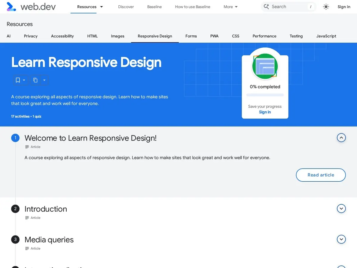
For most Indian businesses, most visitors arrive on a phone, often a mid-range Android device. If menus are fiddly, buttons sit too close together, or text needs zooming, those visitors do not complain — they leave. Test every important page on a real phone, with one hand. Google's free Learn Design course on web.dev is a good plain-English introduction to responsive design if you want to understand what your developer should be doing.
3. Slow pages dressed up as rich pages
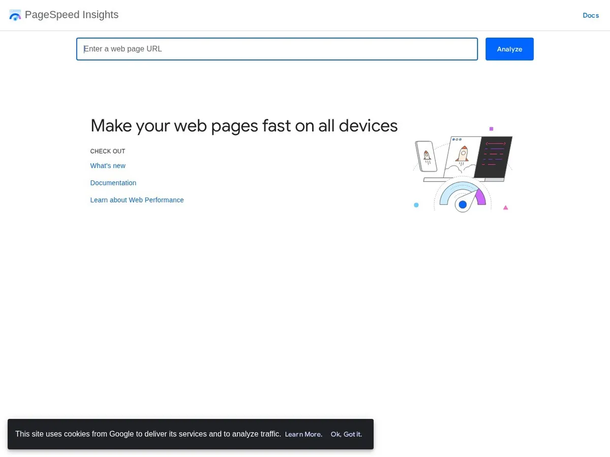
Auto-playing videos, huge photos and a dozen plugins can look impressive in a meeting and feel painful on a real connection. Speed is a design decision, not just a technical one. We covered the cost in our guide to why website speed costs you customers: in short, every extra second gives more people time to give up.
4. Forms that ask for everything at once
An enquiry form does not need a full address, budget range and three dropdowns before a first conversation. Every extra field lowers the number who finish. For most small businesses, name, phone or email, and one open box is enough; collect the rest later. At checkout, show delivery charges early, offer payment methods Indian customers expect, and never force account creation before payment.
5. Pretty text nobody can read comfortably
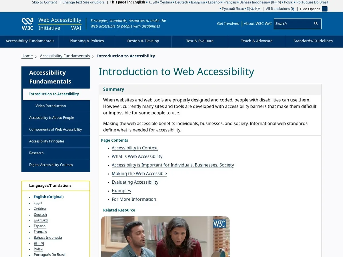
Light grey text, tiny fonts and long unbroken paragraphs look elegant in a design file and fail in sunlight on a phone screen. Keep body text comfortable, use strong contrast, and break content into short sections. Accessibility is part of this, not an extra: the W3C's introduction to web accessibility explains why designing for different eyes, devices and abilities improves the experience for everyone, including older customers and anyone using a cracked screen in bright light.
6. Hiding the information people came for
Visitors arrive with practical questions: How much does it start from? Do you serve my city? How long does it take? When answers are missing, people assume the worst and enquire elsewhere. You do not need a full rate card. Honest starting prices ("Websites from ₹24,999, final quote after a short call"), service areas and timelines remove most of the fear. This sits inside the wider basics in the key aspects of a successful website design — content and clarity matter as much as layout.
7. Interrupting before you have helped
A pop-up in the first five seconds, a chat widget covering the call button, and a notification prompt on top of both: the visitor has read nothing and already feels pushed. Let people read, scroll and understand first. One well-timed, easy-to-close prompt is enough.
How to check your own website this week
You do not need software for a first check. Ask a friend who does not know your business to open your site on their phone and complete your main goal: send an enquiry, or place a small order. Watch silently. Where they hesitate or ask a question, you have found a UX problem worth fixing. That evidence also makes a redesign brief clearer, whether the work sits under custom website development or a focused design refresh.
What fixing this honestly costs
A focused UX review and a round of fixes usually takes days, not months, and costs far less than a full redesign — commonly in the low tens of thousands of rupees depending on the pages involved. A full redesign makes sense only when the structure itself is wrong. Anyone who promises to "double your conversions" for a fixed fee is guessing; honest work measures the starting point, fixes clear obstacles, and checks the numbers again after a month.
Want a second pair of eyes on your website? Tell us about your project — send us your website address and the one action you most want visitors to take, and we will tell you plainly what is getting in their way.
Questions people ask us
How do I know if my website has a UX problem?
The clearest signs are traffic without enquiries, a high share of visitors leaving from the first page, and customers asking questions on calls that the website should already answer. The friend-on-a-phone test above will usually confirm it in ten minutes.
Should I redesign my website or just fix the UX?
Fix first, in most cases. If the structure, branding and content are sound, clearer buttons, faster pages, shorter forms and honest pricing information can lift results without the cost and risk of starting again. Redesign when the site is outdated, hard to update, or built around the wrong offer.
Does UX really matter for a small local business?
Yes — often more than for a large brand, because a large brand is already trusted. A local business wins or loses on small signals: a tap-to-call button that works, prices that are easy to find, and a page that loads quickly on a phone.
What is the single highest-impact UX fix?
Usually the combination of a clear main button and a fast mobile page. If visitors instantly understand what to do next, and the page does not keep them waiting, most other improvements become easier to measure and worth doing.
